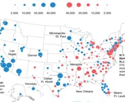
Mapping America's Singles

Trying to figure out what city to move to for the best “ratio,” as various chaches like to say? Check out this map. The red represents the metro areas with more single women than men; the blue means it’s more of a “rugby match.” I’m no census expert, but the trend moving east to west is pretty startling. What’s the deal? Is this the legacy of the goddamn GOLD RUSH? A few thoughts:
* Something to add to the never-ending L.A. vs. NYC debate: NY/Northern N.J. has 210,820 more single women then men, while L.A.-Long beach-Santa Ana has 89,459 more single men than women. (Meanwhile, are these really such big disparities when you consider that New York City alone has over 8 million people? I’m no mathematician, I just play it how I see it. And in New York I see mad dudes.)
* Why do so many dudes kick it in Florida? Was this census taken during SPRING BREAK?
* Congrats to those courageous single women who made it all the way out to New Mexico.
* What is that one red dot in California? Sacramento? I didn’t know it was a lesbian city…
* If you’re a straight dude on the West Coast, just be glad you don’t live in China, where the preponderance of blokes is considered by some to be a “demographic time bomb.”
* This map only cover singles ages 20-64. So if you're an octogenarian looking to get it cracking, pay no mind.
[via New Republic]


Comments
(0)POST YOUR COMMENT